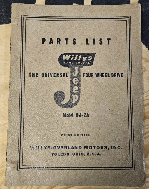
UPDATE IV: Branden found this 1945 Parts List booklet that includes a prominent “J” logo. This is the most prominent use of the logo that I’ve seen. It’s not clear to me whether this booklet was introduced with the jeep in August of ’45 or a little later in ’45.
==============================
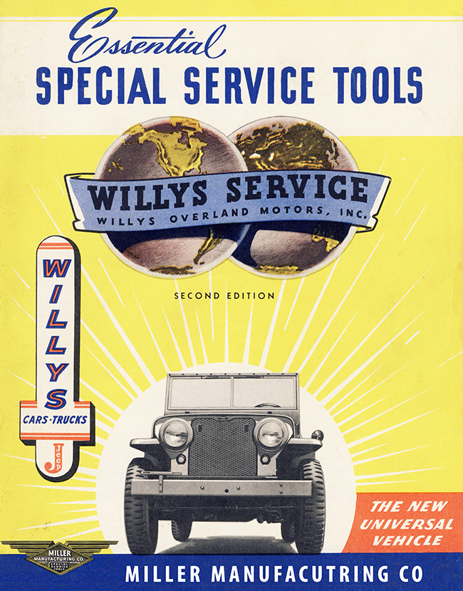
UPDATE III (04/07/2019): Maury spotted the a “J” dealership sign example on this Miller Tools brochure:
UPDATE II: I’ve added two examples of ‘dark’ “J”s, dark (blue or black) background with white letters. Now that I think about it, I guess this is similar to the black and white newspaper versions.
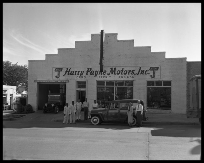
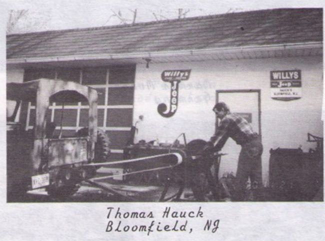
CREDIT: Douglass, Neal. Harry Payne Motors, photograph, June 3, 1942; (https://texashistory.unt.edu/ark:/67531/metapth34338/m1/1/: accessed April 7, 2019), University of North Texas Libraries, The Portal to Texas History, https://texashistory.unt.edu; crediting Austin History Center, Austin Public Library. … MY NOTES: The photo year is more likely late 1947 or 1948.
UPDATE: This is best described as a working draft that Maury Hurt and I have constructed in the hopes of understanding Willys-Overland’s “J” logo better …. If you have input, please email me or add it in a comment at the bottom of the post.
In January of this year, Maury emailed me about a Willys/Cars•Trucks/Jeep logo that he was hoping to reproduce, wondering if I had any better examples of it. That simple email turned into a mission: Find out the history behind the logo.
It turned out that we could find no articles or discussion about the evolution of the logo. So, we spent a month looking through old brochures and advertisements to develop a theory of what it should look like, when it was used, and why.
What’s the logo supposed to look like?
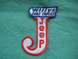
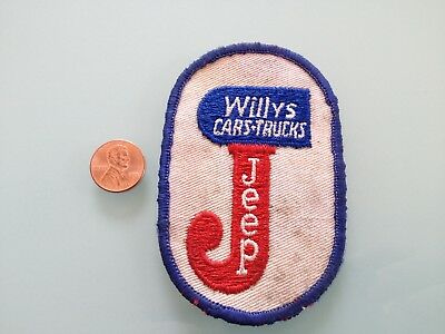
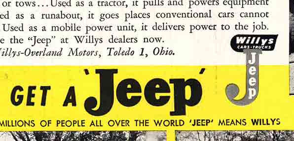
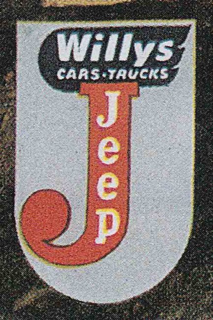
Our first challenge was to determine what the logo was supposed to look like. As these examples show, different fonts and slightly different looks were used in the printing of the logo.
or even this one …
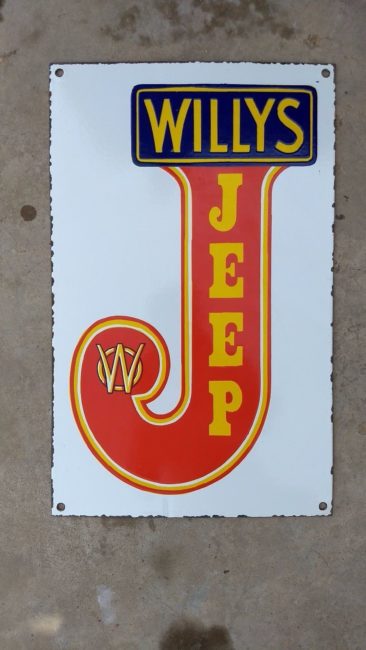
Our suspicion is that this is from overseas, possibly Australia? We don’t have a time frame on this one.
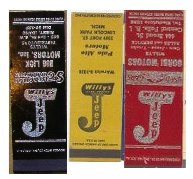
And, the list would not be complete without some matchbook covers:
How should the “J” look?
