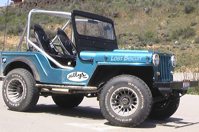
Yesterday, I spent some time deciding how Lost Biscuit’s name should appear and where I might put an ewillys logo.
Building the Logo
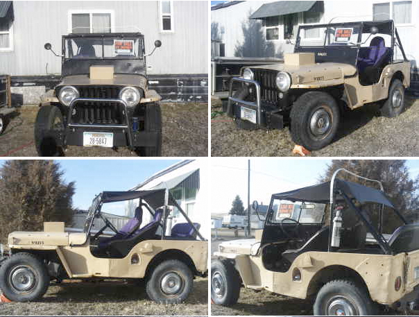
The simpler of the two items to create was the eWillys logo ‘sticker’. I took an EPS version of the eWillys logo, increased the size in photoshop and then applied it to the jeep. You can see in the first image below, which is entirely a photoshop mockup, that it works pretty well.
However, when I increased the logo further, printed it out, and placed a paper version on the jeep, the logo appears washed out. I think I need to embolden the eWillys name to give it a darker appearance when printed. The actual sticker will be stuck to a thin plate (probably an aluminum plate made from a street sign which i can pick up cheaply at my local metal recycler). That makes attaching the logo, and getting it positioned correctly, easier.
Finally, after staring at it over the last few minutes, I have decided to put some more white space above the logo itself — it feels too crowded at the top. So, I’m going to center the logo a little more within the ellipse.
Creating Lost Biscuit’s name
Creating the Lost Biscuit name was more of a challenge, mostly because I needed to settle on a font. I knew I did not want a pure san-serif font (think arial, helvetica fonts), because I felt that would be too angular and void of personality. I didn’t want too much of a serif font (think Times or Garamond), as that would be too formal.
No, I needed something slightly modern and slightly whimsical, which is how I settled on an italicized Tekton Pro. After experimenting, I also decided to go with all capital letters (and increasing the size of the letters L and B) as it I thought it worked better visually.
In image 1, the photoshopped image, the size looks just about right. I tried it in black, but decided white worked the best. In the second image, I printed and cut out the letters, leaving small strips of paper to keep the letters connected. Unfortunately, after all the work of cutting out the letters, I decided that 4″ tall letters were too tall. So, I dropped the letters to 3 1/2″, which I think will work well (to be tested very soon). Once I finalize the design, I’ll head to a local graphics shop and have them made.
