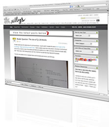
 As you can see, a couple days ago I updated the site design. I had several reasons for doing this. (1) the drop down menus were sucking, (2) the drop down menus wouldn’t allow me to do the top sliders like I tested (3) the previous design was having some problems in Internet Explorer, and (4) the logo design wasn’t well designed for t-shirts, merchandise and an expansion beyond the web.
The next step in the process is to go back through all my posts and reorganize them into new sections, so changes will be ongoing …
– Dave

Dave,
You should receive some kind of medal. Alll of us who visit your website, even daily, so appreciate all the posts. You are a dedicated and kindly individual. Thank You Very Much. S.
I’m thinking a Congressional Medal of Honor wouldn’t be too much to ask, would it??? I guess I won’t hold my breath on that.
Thanks for the note; it’s much appreciated 🙂
– Dave
Thank you for the update, it is looking very nice now! And the content….awesome!
Thanks Jonah .. if you have an ideas for improvements, pass’m my way.
– Dave
Much better. Your old theme had troubles with Firefox as well. I’m an old school Mac guy, but have been using Linux for about five years. It’s nice to have a site look good in your favorite browser.
I agree with you Dan. I hadn’t check the site in IE in about a month and was surprised that it was left aligning with side of the screen (still not sure what change caused that). That sped up my decision to make the design change.
I too used Firefox (on my mac) and ran into some glitches. Hopefully, this design will be a little more stable as I make additional changes … If something does seem like it’s working right, it is probably not. Feel free to drop me a line as I spent 95% of my time using only the backend of the site rather than viewing things from the front end.
– D